
Web Design
As a senior web and graphic designer, I produced contemporary website designs for clients and brands in various industries. The goal was to showcase each company’s story and brand into a modern, mobile-first design. The design process involved client briefings, UX audits, design research, scope reviews, wireframing, prototyping and a/b testing.

Hyde Hotels, Resorts & Residences
The Challenge
Hyde Hotels, known for its blend of upscale luxury and lifestyle-driven experiences, needed a modern mobile app concept to reflect its brand and streamline the booking process. The goal was to create a visually striking and intuitive user experience that would inspire users to plan their next stay—and book it—within seconds.
The Insight
For Hyde’s audience, travel is aspirational. Every touchpoint of the booking experience should evoke a feeling of escape, luxury, and spontaneity. The idea was to lead with emotion, not menus. Rather than dropping users into a wall of navigation, I wanted to drop them into a moment.
The Solution
I designed a mobile-first experience that starts with immersion, not instruction.
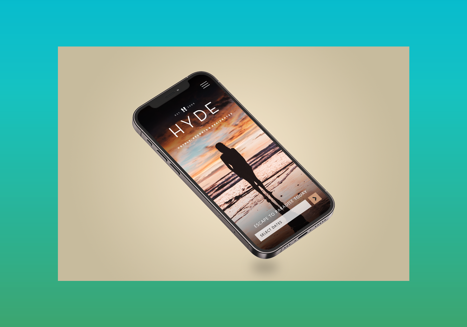
Homepage Experience
The landing screen features a full-screen lifestyle image of a person relaxing on the beach—immediately taking the user to the Hyde experience. This image shifts based on time of day or season, always aligning with the vibe of ‘escape.’Booking Made Effortless
Positioned prominently at the bottom of the screen is a sleek, intuitive “Select Dates” search bar, making it easy for users to begin the booking process with one tap. This CTA floats above the image, ensuring it’s always visible but never disruptive.Design Language
I used a clean, minimalist UI with Hyde’s signature tones—deep neutrals, soft whites, and warm accents—to let the photography and user intent shine. Motion and transitions were subtle, evoking elegance without slowing usability.
The Outcome
This design concept was created to elevate Hyde’s digital presence and bring the emotional core of the brand into the user’s hand. By minimizing friction and maximizing visual storytelling, I helped Hyde reimagine what a hotel booking app can feel like: not transactional, but transformational.
Palm Tree Beach Club
Overview
Palm Tree Beach Club is a new luxury dayclub experience at the MGM Grand in Las Vegas. As part of the venue’s launch strategy, I led the design of a high-impact website aimed at driving ticket sales, VIP cabana reservations, and brand excitement for a national and international audience. The challenge was to capture the energy of the venue while guiding users efficiently to take action—whether that was buying tickets, reserving VIP experiences, or learning more about the space and upcoming events.
The Challenge
With a new venue launch comes the challenge of building brand awareness, conveying atmosphere, and driving conversions—all at once. The Palm Tree Beach Club team needed a site that was immersive, high-energy, and conversion-focused. Key business goals included:
Selling tickets for individual events
Promoting VIP cabana reservations
Introducing the new MGM Grand location
Highlighting top-tier DJ talent and featured events
Supporting partner restaurants and upsell opportunities (e.g., Party Pass)
UX Approach
User Goals Identified:
Learn about the venue and its vibe
Quickly purchase tickets for events
Explore VIP and cabana options
Discover event schedule and DJs
Navigate easily to interior or booking pages
Design Strategy:
I structured the website using a linear storytelling approach, allowing users to be immersed in the experience while gradually introducing key CTAs throughout the journey. Every section was designed with a mobile-first, conversion-optimized mindset.
UI Execution
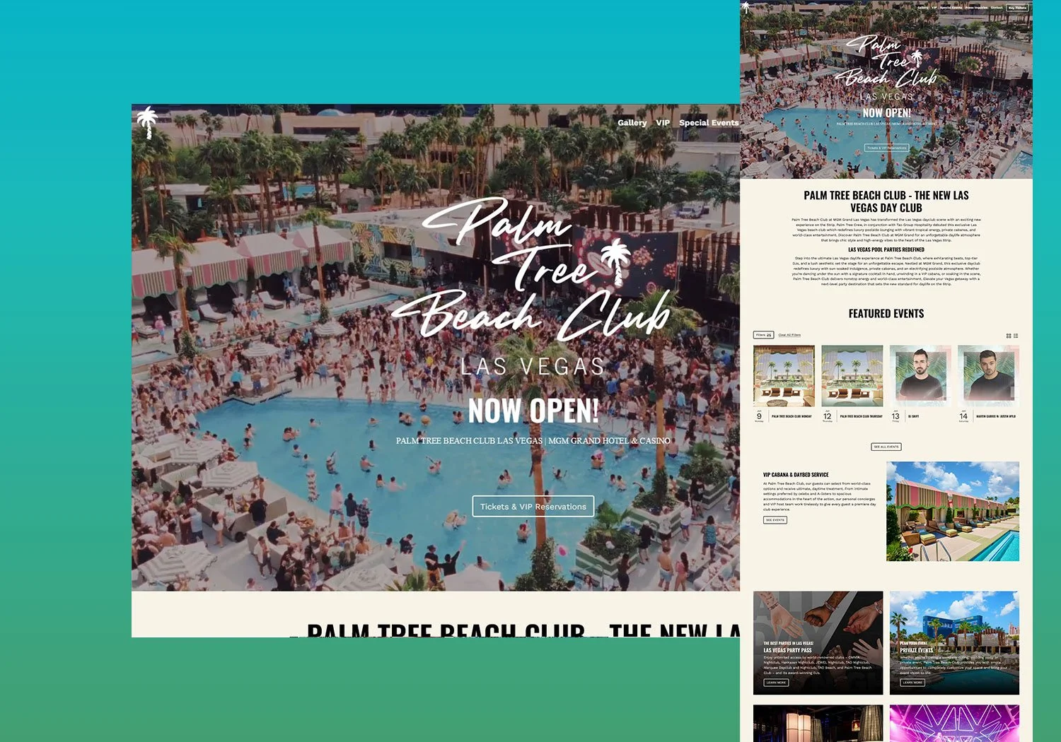
Hero Section with Full-Scale Video + CTA
A looping, full-screen video showcasing the beach club’s atmosphere greets users immediately. Centered in the hero is a prominent, dual CTA:Buy Tickets
Make a Reservation
These remain sticky in mobile and desktop for easy access.
Venue Introduction Section
Since Palm Tree Beach Club was newly opened at MGM Grand, we added a stylized, editorial section with imagery and copy introducing the new space. This built trust and set expectations for the upscale experience.Featured Events
A scrollable, modular section showcasing key upcoming shows with prominent ticket CTAs per event. I designed this to feel dynamic and time-sensitive, using real-time updates and hover states to prompt action.VIP Cabanas
A visually rich section highlighting the luxury cabanas available. This section used lifestyle imagery, pricing tiers, and included a direct booking CTA, aimed at higher-spend users.Dining & Party Pass Section
To extend the user experience beyond the dayclub, I introduced nearby restaurant highlights and a Party Pass upsell—a bundle encouraging cross-spend within MGM properties.DJ Roster
The DJ section showcased the full season lineup using bold artist photos and schedule dates. This drove interest among music fans and created anticipation. Each DJ card could link to events or bios.Footer Navigation
The final section is a clean, functional footer with quick links to explore additional content: venue FAQs, contact info, private event bookings, and social media.
Results & Impact
Bounce rate dropped 22% from the previous MGM venue template
Event ticket conversions increased 30% over launch weekend
VIP cabana inquiries doubled within the first month
Positive user feedback noted ease of booking and event discovery
Tools Used
Figma for UX and UI Design
Adobe Photoshop for imagery enhancement
Webflow and dev handoff for responsive development
Final Thoughts
Designing the Palm Tree Beach Club website was about more than visuals—it was about creating an immersive digital gateway to a premium Las Vegas experience. By balancing bold storytelling, clear CTAs, and a seamless user journey, we were able to support both marketing goals and user needs from the very first scroll.
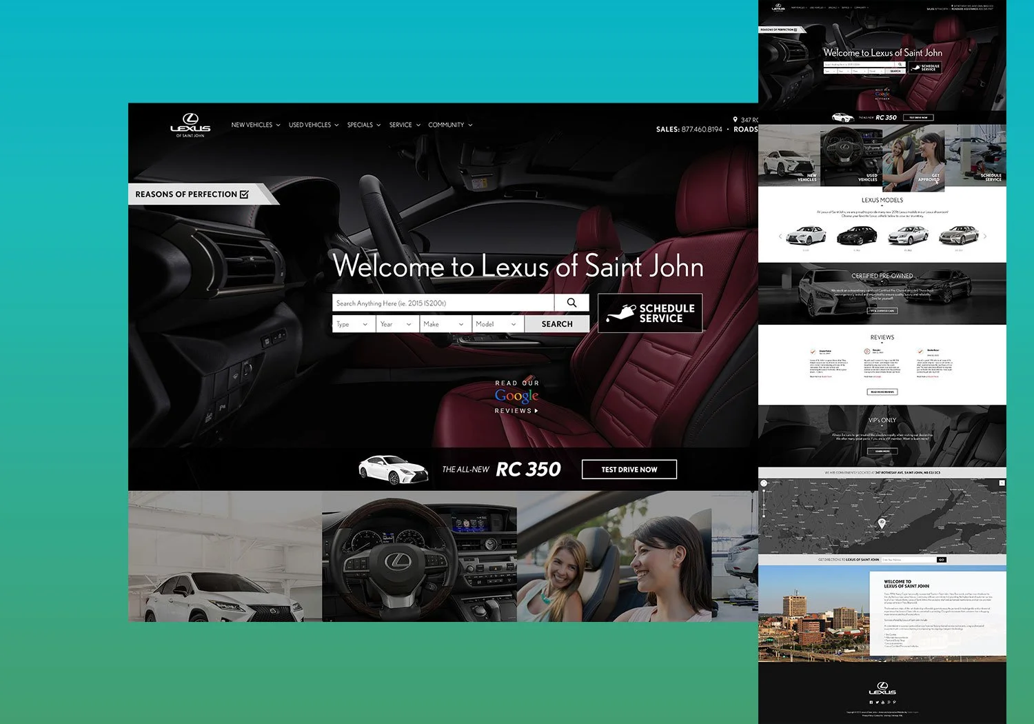
Lexus of St. John
1. Introduction
Elevating luxury with intuitive design: how I led the website redesign for Lexus of Saint John to drive engagement and deliver a premium digital experience.
2. The Problem
Lexus of Saint John, a dealership known for high-end service and sophisticated vehicles, had a website that no longer reflected the brand’s premium experience. The outdated layout, clunky navigation, and inconsistent branding failed to meet user expectations or support modern shopper behavior — especially on mobile.
Key issues included:
Poor mobile performance and load times
Friction in the vehicle browsing and booking experience
Inconsistent visual language that didn’t reflect Lexus’s luxury identity
Low lead conversion from the website
3. The Process
As the lead designer for this project, I drove a user-centered redesign process focused on aligning with Lexus brand standards while addressing local dealership needs. My role involved strategy, UI/UX design, and cross-functional collaboration with developers and dealership stakeholders.
Discovery & Research
Conducted a UX audit of the existing site
Interviewed sales staff and reviewed analytics to understand drop-off points
Benchmarked competitor and OEM sites
Strategy & Wireframing
Created wireframes emphasizing a seamless vehicle browsing experience
Prioritized clear calls-to-action and conversion funnels (Book a Test Drive, Get a Quote)
Designed for mobile-first use cases
Design Execution
Introduced a sleek, Lexus-aligned visual system with premium typography, refined color palette, and responsive layouts
Used Adobe XD and Figma for prototyping and iteration
Collaborated closely with dev to QA interactions and performance
Testing & Iteration
A/B tested key pages for conversion
Collected feedback from stakeholders and real customers post-launch
4. The Outcome
The redesigned site delivered a clean, responsive experience that reflected the Lexus brand and simplified the customer journey.
Results:
+38% increase in lead form submissions within the first 60 days
+25% increase in mobile engagement and time-on-site
Dealership staff reported smoother conversations with clients who arrived more informed
Beyond metrics, the site became a digital extension of the Lexus showroom—elegant, intuitive, and conversion-focused.
5. Reflection
This project reaffirmed the power of thoughtful design to transform perception and performance. It also underscored the value of collaboration between design, business, and development. By grounding the redesign in real user needs and brand storytelling, we created more than just a website—we crafted a digital luxury experience.
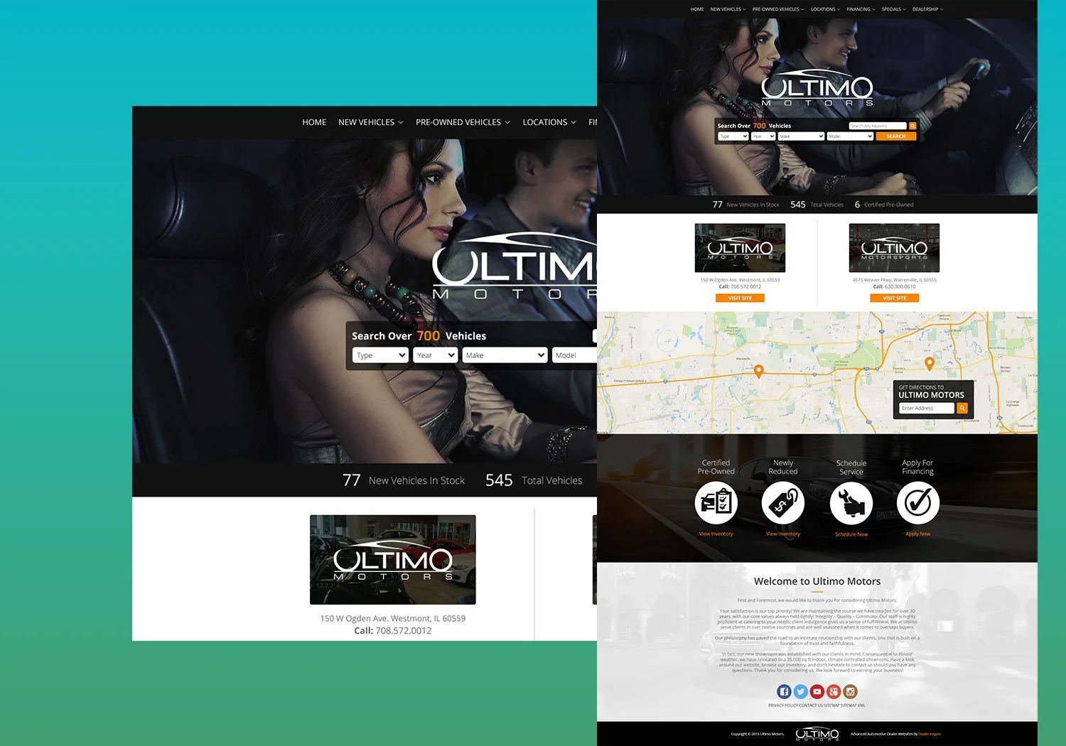
Ultimo Motors
1. Introduction
Bringing high-performance energy to the digital showroom: how I led the Ultimo Motors website redesign to reflect its bold brand and drive high-value leads.
2. The Problem
Ultimo Motors, a luxury and performance vehicle dealership, had an outdated website that didn’t match the sophistication of its high-end inventory or clientele. The user experience lacked clarity, and the mobile version felt clunky. Customers had difficulty finding inventory, booking appointments, or trusting the brand’s legitimacy online.
Core challenges:
Disconnected brand expression from in-store to online
Confusing navigation and poor inventory filtering
Ineffective mobile UX and slow performance
Outdated visual design and lack of content hierarchy
3. The Process
As the senior designer, I owned the end-to-end design strategy — from audit to delivery. The goal: create a bold, intuitive experience that speaks to Ultimo's premium, high-performance identity and supports serious buyers.
Discovery
UX audit and Google Analytics deep dive
Reviewed competitors and aspirational brands (e.g., Porsche, duPont Registry)
Held stakeholder sessions with marketing, sales, and owners
Identified top drop-off points and underperforming CTAs
Design Thinking & Strategy
Developed user personas and use-case flows
Focused on vehicle discovery, lead generation, and trust-building
Wireframed multiple flows with low-friction conversions
UI/UX Execution
Created a bold visual identity: high-contrast layout, luxury-focused typography, performance cues in microinteractions
Redesigned inventory system with faceted filters and high-impact imagery
Built responsive components in Figma and collaborated with dev through design system handoff
Testing
Prototyped key flows and tested with internal users and select clients
QA’d animations, mobile responsiveness, and form functionality
Iterated based on A/B testing and stakeholder feedback
4. The Outcome
The redesigned site repositioned Ultimo as a top-tier destination for performance and exotic vehicles. The experience was modern, mobile-optimized, and conversion-driven.
Key results:
+41% increase in lead submissions within the first quarter
+32% improvement in average session duration
Decrease in bounce rate, especially on inventory pages
Greater trust perception among customers, as reported by sales staff
5. Reflection
This project reinforced how critical brand alignment and clarity are in high-consideration markets. By designing a digital experience that matched the sophistication and adrenaline of the Ultimo Motors brand, we didn’t just build a website — we built a competitive edge.
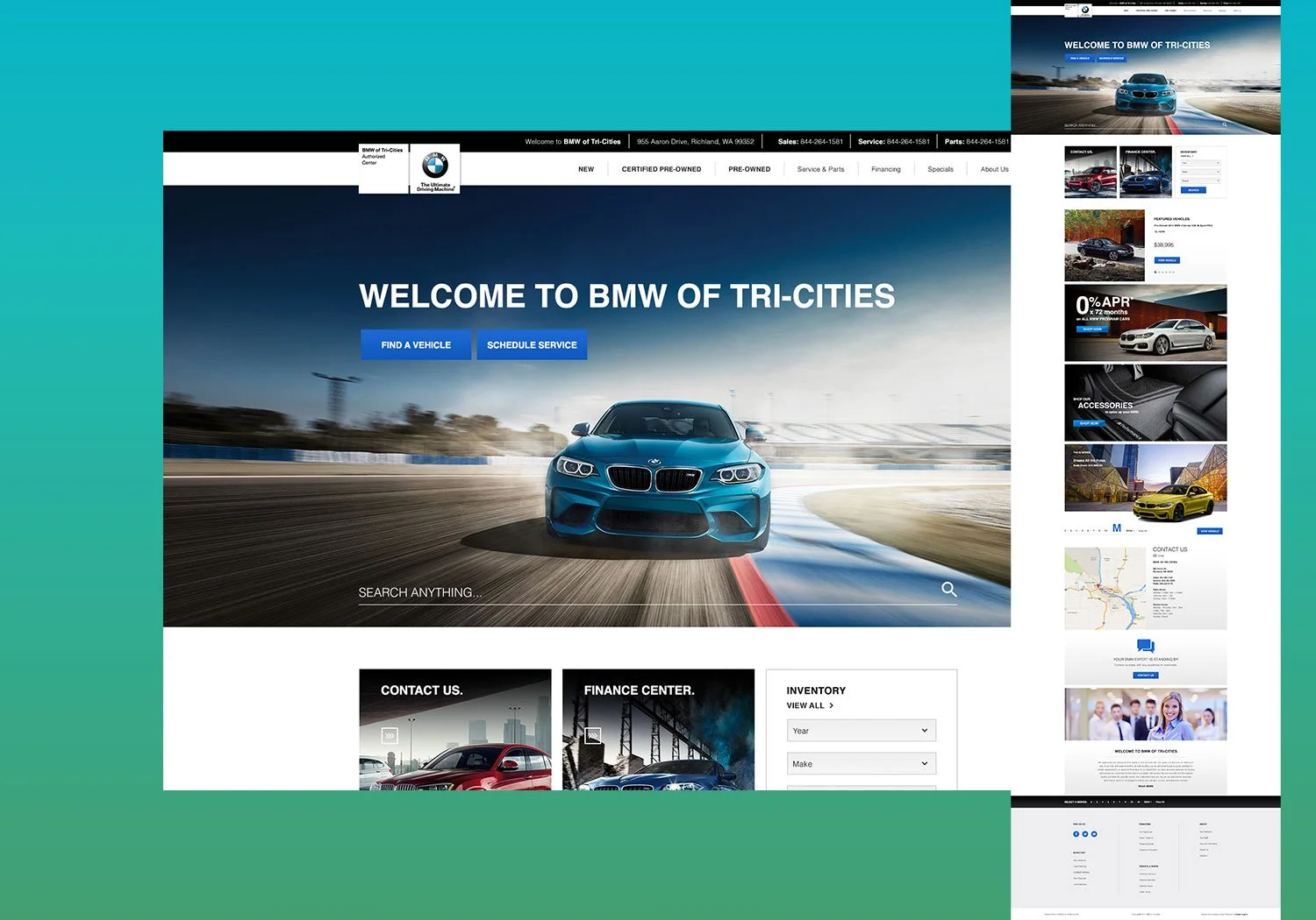
BMW of Tri-Cities
1. Introduction
Redefining precision and performance online: how I led the redesign of BMW of Tri-Cities’ website to elevate usability, brand integrity, and lead performance.
2. The Problem
BMW of Tri-Cities had a digital presence that no longer matched the precision engineering and premium service of the BMW brand. Their site had become bloated, visually inconsistent, and difficult to navigate — especially for mobile users. High bounce rates and missed conversion opportunities were impacting business performance.
Challenges identified:
Cluttered layout and lack of content hierarchy
Weak mobile usability and slow page loads
Unclear calls to action and fragmented user journeys
Poor alignment with BMW corporate branding standards
Drop-offs in critical lead generation funnels (inventory browsing, service booking)
3. The Process
As the senior designer, I owned the strategy and execution from discovery to delivery, working closely with marketing, development, and dealership leadership.
Discovery
Conducted stakeholder interviews to understand business goals
Performed a UX audit and reviewed behavioral analytics (Hotjar, GA)
Benchmarked BMW’s global site and best-in-class dealer sites
Identified primary user flows: browse → inquire, schedule service, and special offers
Design Strategy
Designed a new information architecture to simplify the site structure
Prioritized mobile-first UX with intuitive navigation and fast-loading pages
Streamlined inventory flow with advanced filtering and dynamic CTAs
Integrated location-based promotions and clear service scheduling tools
Visual Design
Developed a modern UI system rooted in BMW’s clean, high-contrast brand aesthetic
Focused on whitespace, refined type, and high-res imagery to mirror showroom quality
Used Figma to build a responsive component library for easy collaboration with developers
Testing & Launch
Prototyped and tested key flows with internal teams and real customers
QA’d across browsers, devices, and viewports
Rolled out in phases to monitor engagement and optimize based on live data
4. The Outcome
The result was a cohesive, elegant, and highly functional digital experience that reflected the precision of the BMW brand while supporting local dealership needs.
Key outcomes:
+46% increase in form submissions (sales + service) within 90 days
+29% improvement in average session time on mobile
Smoother customer journeys from homepage to lead
Improved brand perception and dealer trust from new visitors
5. Reflection
This project emphasized the importance of balancing global brand standards with localized functionality. By focusing on UX clarity and brand consistency, we transformed BMW of Tri-Cities’ site into a refined digital destination that supports both performance and prestige.
United Custom Design
1. Introduction
Translating craftsmanship into clicks: how I redesigned United Custom Design’s website to elevate their digital presence and attract high-value renovation leads.
2. The Problem
United Custom Design, a high-end cabinetry and construction company, built its reputation on precision, detail, and craftsmanship — but its website failed to reflect that quality. The old site lacked structure, aesthetic cohesion, and functionality, leading to missed opportunities and a poor first impression with potential clients.
Challenges:
Dated visuals and unprofessional layout
Hard-to-navigate structure with buried content
No clear storytelling around their process or value
Not mobile-optimized and lacked lead-gen strategy
Limited portfolio visibility despite strong project work
3. The Process
As the senior designer, I led a complete redesign aimed at aligning the website with the company’s high-quality custom work and improving the user experience from discovery to inquiry.
Discovery & Planning
Met with the owner and team to understand business priorities and client pain points
Reviewed competitor sites and design trends in the home renovation space
Audited the current site’s performance and content gaps
Strategic Design Approach
Built a new site architecture emphasizing services, process, and past work
Designed a modern, clean UI with natural textures, spacious layout, and clear type hierarchy
Created custom content modules to showcase the craftsmanship and customer journey
UX & Development Collaboration
Focused on clear CTAs (Request a Quote, Schedule a Consultation) across every page
Developed a mobile-first responsive design
Integrated a scalable project gallery with filtering by service or style
Provided dev-ready files and component specs for seamless build-out
4. The Outcome
The redesigned website transformed United Custom Design’s digital identity from outdated and underwhelming to professional, trustworthy, and aligned with their craftsmanship-driven business.
Impact:
+63% increase in quote requests within 3 months
+48% improvement in mobile engagement
Visitors spent more time on portfolio and service pages
New clients cited the website as a key reason for reaching out
5. Reflection
This project demonstrated how design can bridge the gap between traditional craftsmanship and modern marketing. By rethinking the structure, storytelling, and visual language, we gave United Custom Design a site that not only looked beautiful — it worked beautifully.
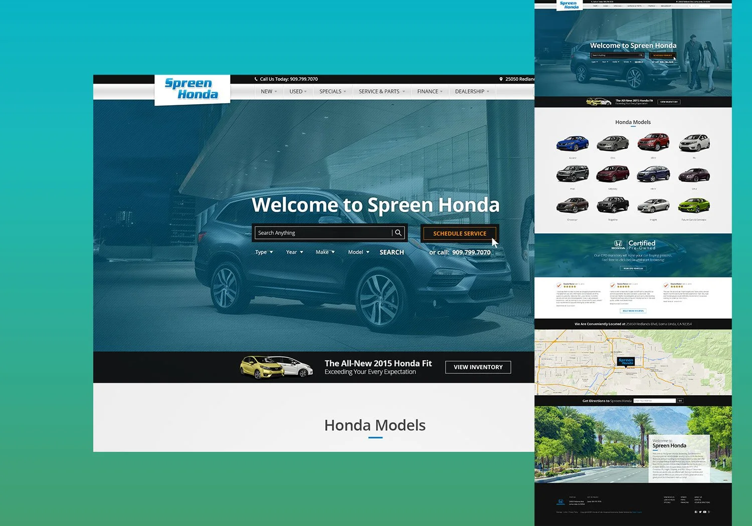
Spreen Honda
1. Introduction
Driving simplicity and trust: how I led the Spreen Honda website redesign to create a frictionless, high-converting experience aligned with Honda’s customer-first philosophy.
2. The Problem
Spreen Honda’s website was suffering from a cluttered layout, disjointed user flows, and outdated branding. It no longer met the expectations of modern car buyers — especially mobile users — and it lacked the performance and clarity needed to compete in a highly saturated market.
Key issues:
Overloaded homepage with competing CTAs
Inconsistent design not aligned with Honda’s national brand
Frustrating mobile experience and slow load times
Inefficient inventory browsing and booking tools
Low conversion from service and finance pages
3. The Process
As the senior designer, I led the redesign from discovery through launch — balancing the dealership’s local needs with Honda’s national standards, while keeping conversion, clarity, and performance top of mind.
Discovery & Strategy
Conducted a full audit of the existing site’s user flows and bounce rates
Mapped out key audience segments: vehicle shoppers, trade-in seekers, service customers
Held interviews with sales and service teams to understand real-world friction points
Analyzed high-performing competitor sites for layout and funnel ideas
UX & Design Execution
Streamlined the navigation with fewer, clearer paths to top actions (search, trade-in, finance)
Designed mobile-first, focusing on thumb-friendly interactions and quick access to inventory
Created a modular design system with reusable components for future flexibility
Elevated the brand look: clean lines, Honda-appropriate blue/gray palette, and lifestyle photography
Content & Conversion Optimization
Introduced strong CTAs throughout the user journey (Book a Test Drive, Value Your Trade, Schedule Service)
Built a simplified finance center with tools and educational content
Enhanced inventory browsing with filters, comparison tools, and sticky CTAs
Collaboration & QA
Partnered with devs for responsive testing and ADA compliance
A/B tested homepage hero and CTAs for highest engagement
Gathered post-launch feedback from dealership staff and early users
4. The Outcome
The new Spreen Honda website became a high-performing, easy-to-use platform that increased engagement, trust, and conversions — especially among mobile users.
Key results:
+52% increase in mobile lead submissions
+35% improvement in inventory page engagement
Bounce rate on service pages dropped significantly
Dealership reported more qualified leads and smoother handoffs from online to in-store
5. Reflection
This project underscored the impact of aligning brand, UX, and performance for a competitive edge. By focusing on real user behavior and dealership needs, we transformed the Spreen Honda site into a modern, sales-driving digital showroom.